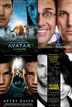
 By Breanne Brennan You've all seen it: Movie posters that for some reason show half of a character's face. I'm not sure why many designers choose this approach...maybe it's laziness, lack of promotional photos, hiding a deformity, or (as shown in the AFTER EARTH poster) it looks either intimidating or badass(?) Whatever the case, I personally find it to be lazy. Take the DINNER FOR SCHMUCKS poster. What does it tell you about the film? Well...Steve Carell looks creepy as hell, is too close for Paul Rudd's comfort, and is probably a schmuck. So, where's the dinner? Understandably, it's a teaser poster, but why can't we see all the weirdos sitting at a dinner table being weird? You'd get more information about the movie, and it would look better. A more recent instance is the poster for THE INTERNSHIP... 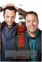 WWW.IMPAWARDS.COM WWW.IMPAWARDS.COM Huh? Oh, wait. I thought this was the poster for THE DILEMMA. My bad. 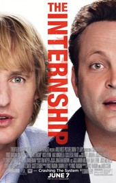 WWW.IMPAWARDS.COM WWW.IMPAWARDS.COM Sorry, they both had red text going down the middle, cropped body parts and Vince Vaughn. Forgive me.
But seriously, what does this poster tell you about the movie? That Owen Wilson's nose is difficult to crop properly? I don't know either. All I hope is that this epidemic of half-faces subsides, but I have a feeling that won't happen any time soon.
0 Comments
Leave a Reply. |
Archives
January 2023
Categories
All
|
 RSS Feed
