|
By Breanne Brennan I love movie posters to put it simply. I work at a movie theatre, so I am surrounded by designs that are good, bad, and ugly. Needless to say, walking by them every day tends to get me thinking. For my first skewering, I lay on the slab the poster for Robert Redford's film THE COMPANY YOU KEEP. To summarize the film in one sentence for those who aren't familiar, an activist (Redford) is on the run and has his identity revealed by a journalist (Shia LaBeouf.) One might think a poster for this movie might look like a gripping thriller, right? Uh, no. We just have the busts of LaBeef and Redford staring jadedly at the cast list in the middle of the poster. What does this imagery say about the film? You probably wouldn't even think that it was about a man trying to outrun his past...oh, wait. That's what the paragraph on the top of the poster is for--to tell you what it's about and what genre of movie it is. And here I thought it was about a May-December romance between two guys. But what could possibly make this poster better? Well, if you're going to categorize this as a thriller, then make it look like one. Redford's character is trying to keep his identity safe, so why not have his back to the audience and his face in partial profile. Maybe some deep shadows, Redford looking out the blinds of a window a little paranoid. Whatever it may be, it should definitely be something that makes us say, "Ooo, that looks interesting." 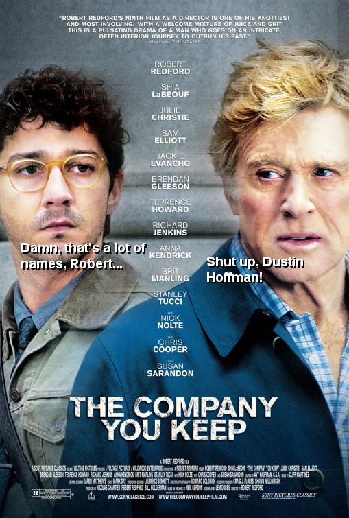
0 Comments
Leave a Reply. |
Archives
January 2023
Categories
All
|
 RSS Feed
